
mySolarEdge From Technical Data to User Empowerment
Splitting the SolarEdge Monitoring Ecosystem
The application that helps users monitor and control their solar system.
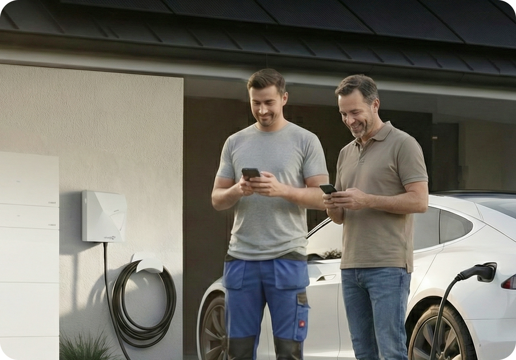
As Lead Designer for the past five years, I participated in the development of SolarEdge's first B2C product, mySolarEdge, which now serves over 3 million users and holds a 4.6-star rating in app stores. My role included conducting competitive market research, global user testing, and defining key objectives and user personas. I focused on delivering a more intuitive and accessible design, enhancing the user experience for homeowners managing their solar systems.
3M
Users
4.6
App Store Ratings

250K
Rating

38
Countries

One Size Did Not Fit All
The Origin: Originally, SolarEdge had a single monitoring app for everyone.
The Problem: We were forcing homeowners to look at the same complex data as certified installers.
Savvy Users wanted full control and CSV exports.
Non-Technical Users just wanted to answer: "Is my system working?" and "Am I saving money?".
The Strategic Shift: We led the design initiative to split the ecosystem into two distinct experiences: SolarEdge Go (for Installers) and mySolarEdge (for Homeowners).
Discovery: Defining the Homeowner (B2C)
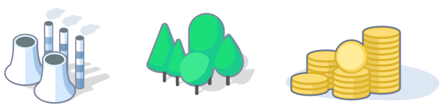
Research: We conducted user interviews and surveys to define the persona. We found that for homeowners, the motivation wasn't just "volts and amps"—it was Money, Backup, and Ecology.
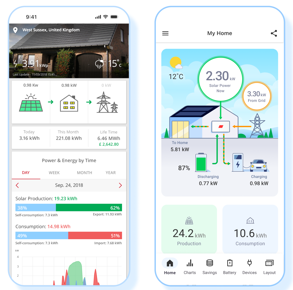
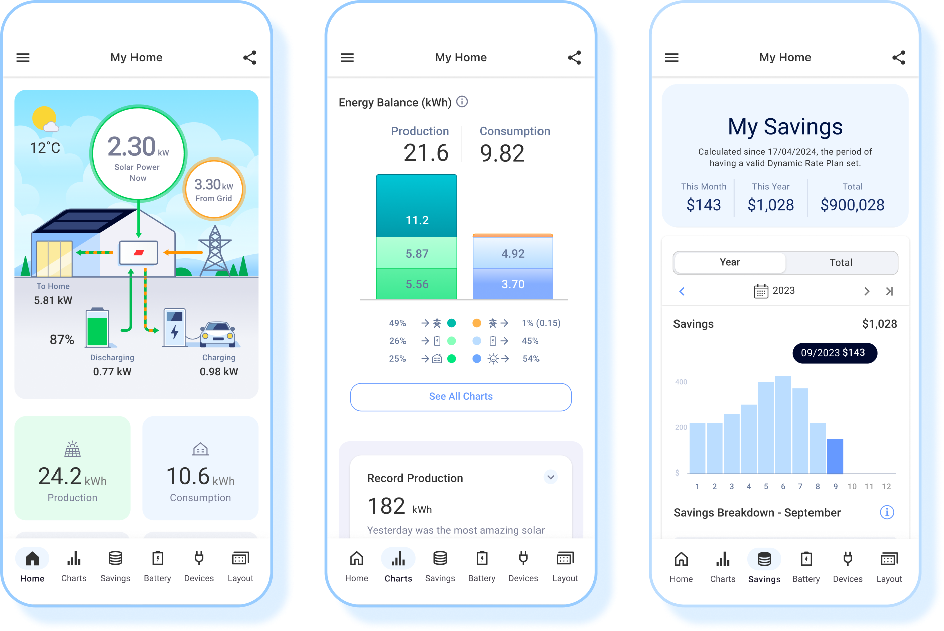
The "Dashboard" Challenge: The old technical diagrams were confusing. Transform the "Technical Energy Flow" into a "Realistic House" visualization that reflects the user's actual home (weather, grid, battery).
The Solution: Visualizing Invisible Energy
The New Power Flow: I moved away from engineering schematics to a "Living House" UI.
Added animations (to show flow direction).
Included real-time weather effects (sun/clouds) that directly correlate to production drops, educating the user without words.
Energy Balance & Graphs:
Before: Production and Consumption graphs overlaid confusingly.
After: Created a clear "Energy Balance" view with distinct colors (Orange for Consumption, avoiding "Red" which implies "Error").
Bill Savings: Designed a new feature to translate "kWh produced" into "Money Saved" based on the user's local utility rates.
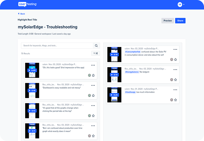
Validation & Testing
Methodology: Conducted usability testing with 8 users worldwide (California, UK, India, etc.) using UserTesting.com.
The Pivot: Testing revealed that while the layout was clean, users struggled with terminology like "Self Consumption."
The Fix: We added tooltips and "Smart Home" icons to clarify data without cluttering the UI.


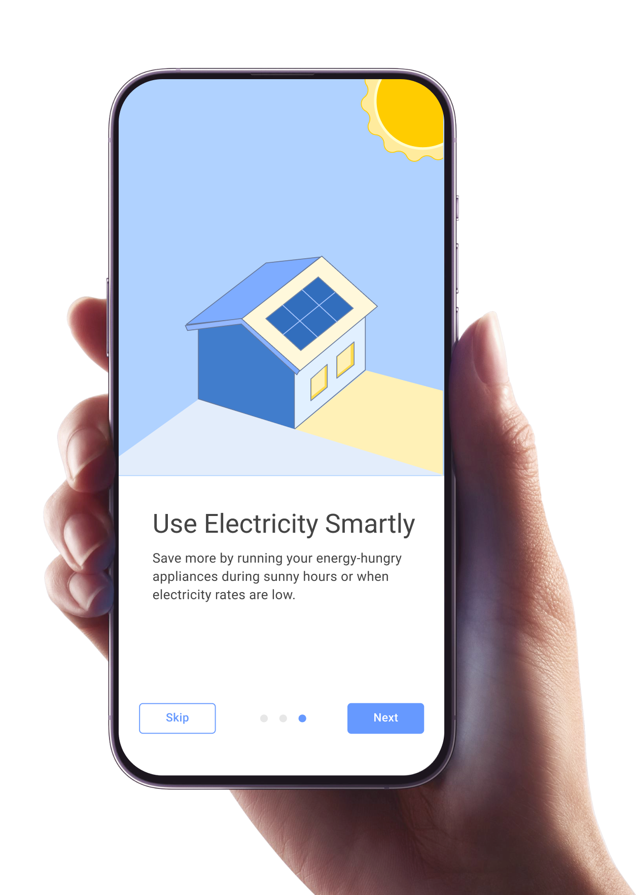
Onboarding Screens
Introducing new users to the app’s core features.
Google and App Store 4.6 Stars reviews
-
Clear and easy to use. We were recently in the US and could still see what our panels were producing!
Nigel Davies
-
This app is really easy to use, and track my solar output, love watching the graphs of what is being used when and where, helps me keep track of my wasted energy as much as possible
Steven Michaels
-
I can say this app (and the system) is the BMW/Mercedes/Audi/Cadillac? of powerful and user-friendly management apps. I love monitoring solar production and metering of our production compared to what we send/grab to/from the grid.
Two creeks